

Basic Color Theory from a Pro
Intro
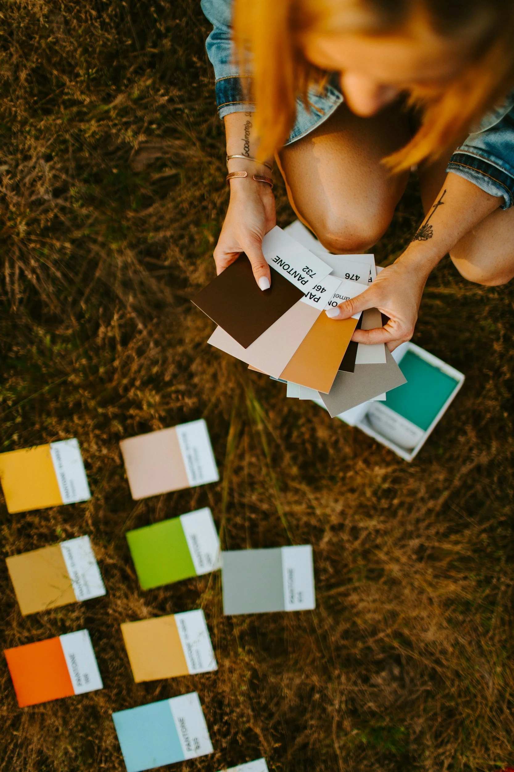
Today, we're diving into the vibrant world of color editing and color theory—an essential skill for every photographer who wants to turn their shots from "meh" to "wow!" Let’s talk about how to choose a color palette that fits your unique style and adds that extra oomph to your photos. First things first, let’s get a bit nerdy with color theory. Remember that color wheel from art class? Turns out, it’s more than just a pretty circle. Colors are divided into primary, secondary, and tertiary categories, and understanding their relationships can help you make informed decisions when editing. Complementary colors (those opposite each other on the wheel) create contrast, while analogous colors (those next to each other) provide harmony. Want to make your subject pop? Try using complementary colors. Looking for a serene, cohesive look? Go for analogous shades.
Editing
If you’re like me, you’ve spent countless hours tweaking sliders in Lightroom or Photoshop, trying to find that perfect hue. Here’s a little secret: sometimes less is more. Instead of cranking up the saturation to neon levels (unless you’re going for a retro 80s vibe), focus on subtle adjustments that enhance the natural beauty of your shot. Play with the HSL (Hue, Saturation, Luminance) sliders to fine-tune specific colors without affecting the entire image. Use a consistent color palette. This doesn’t mean all your photos need to look identical, but having a cohesive set of colors can make your portfolio look polished and professional. If you love earthy tones, for instance, incorporate warm browns, deep greens, and soft creams into your images. This not only helps define your style but also makes your work easily recognizable.
Mood Board

You should create a mood board. Pinterest is your best friend here. Collect images, swatches, and anything that speaks to you. Look for patterns in what you’re drawn to-those are the colors that should dominate your palette. Don’t forget to name your palette something cool and artsy like "Midnight Oasis" or "Vintage Sunrise." Just don’t name it after your pet. No one wants to hear about "Fluffy’s Dreamscape." Another practical tip: Be mindful of your subject and environment. A vibrant red dress might look stunning against a blue sky but could clash horribly with a green background. When planning a shoot, think about how the colors will interact. If you’re shooting portraits, consider the skin tones of your subjects. Warmer skin tones generally look better with cooler backgrounds and vice versa.
Find your own Style
Lastly, don’t be afraid to break the rules. While color theory provides a great foundation, some of the most striking photos come from unexpected color combinations. Experiment with different looks and see what resonates with you. After all, art is about expressing yourself, not just following guidelines.So there you have it—a quick dive into the colorful world of photo editing. Remember, finding your perfect palette is a journey, not a destination. Keep experimenting, keep shooting, and most importantly, keep having fun. Because at the end of the day, the best color in the world is the one that makes you happy.